Camden Oak Partners
A developer brand built to read as permanent, grounded, and quietly confident, the way a track record should.
A developer with a track record, and a brand that hid it
Camden Oak Partners builds and operates multifamily housing across the Southeast. The work was strong and the track record real, but the brand did not say so. It looked like a hundred other developers, which in a business built on trust is an expensive place to be.
Capital partners, municipalities, and residents were all being asked to take the firm on faith. We were brought in to build an identity that carried the weight of the work itself.
Permanence is hard to signal and easy to fake
Developer brands converge for a reason. Everyone reaches for the same skyline marks, the same corporate blues, the same safe and forgettable language. The result is a category where buyers and partners cannot tell one firm from another and fall back on price.
Camden Oak needed to look like what it actually was: a developer building for the long term. That meant an identity grounded in permanence, not novelty.
An identity built on the language of building
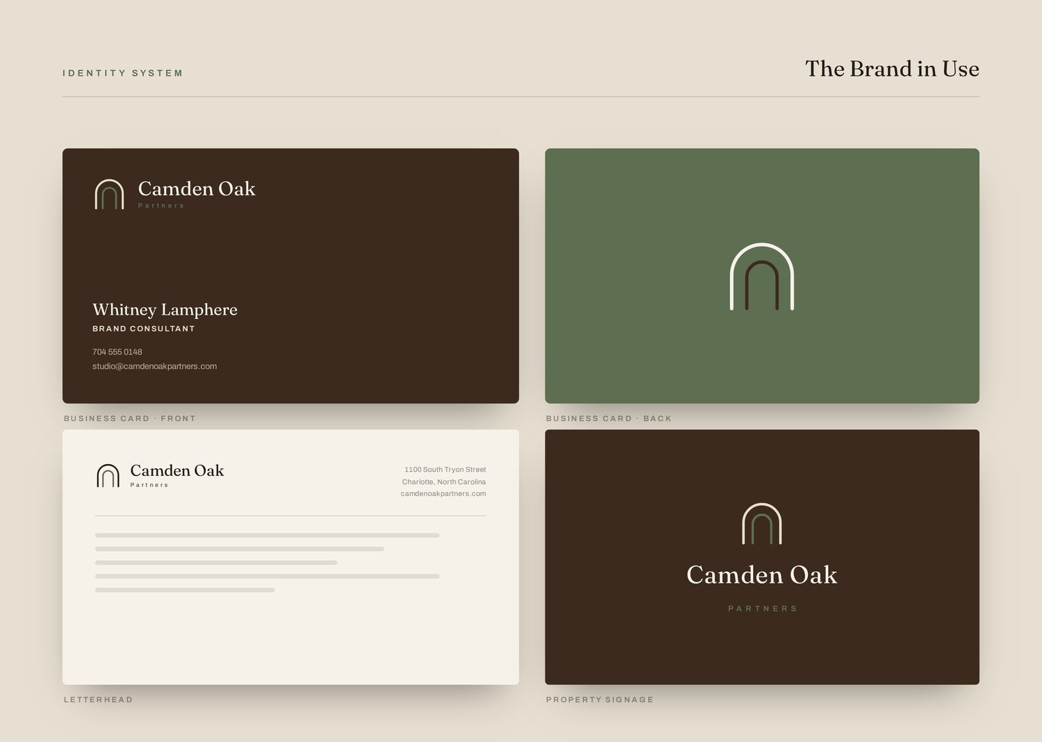
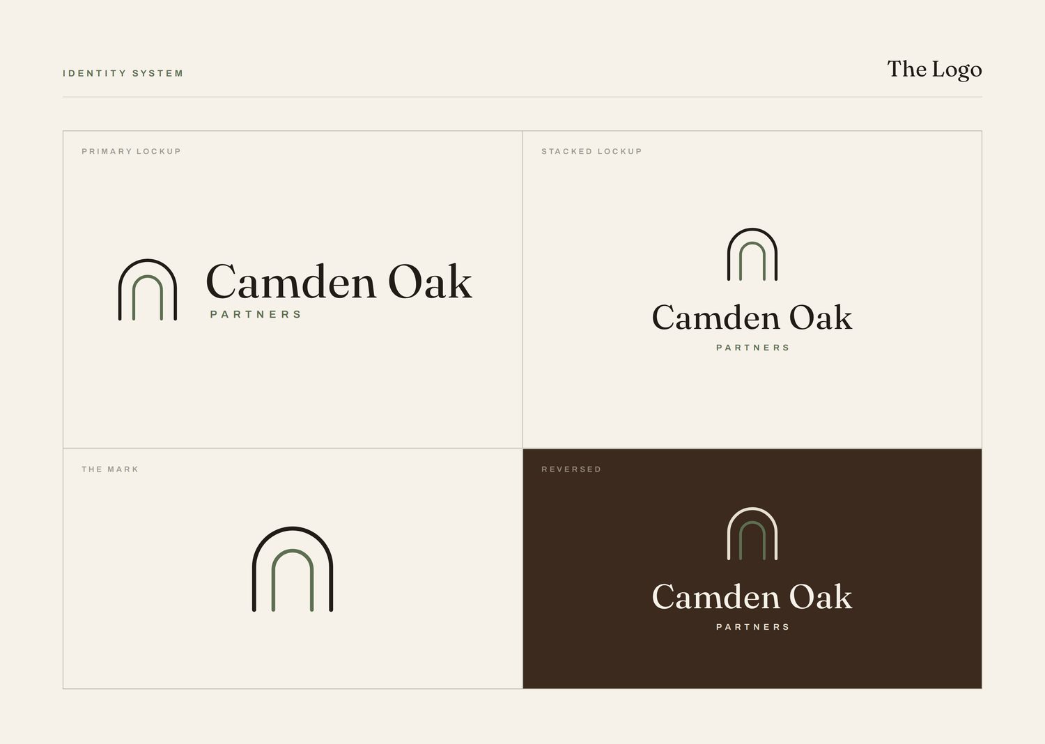
We anchored the brand in the arch, one of the oldest structural forms there is, and a quiet signal of something built to stand. The mark is simple, architectural, and free of the literal skyline cliche.
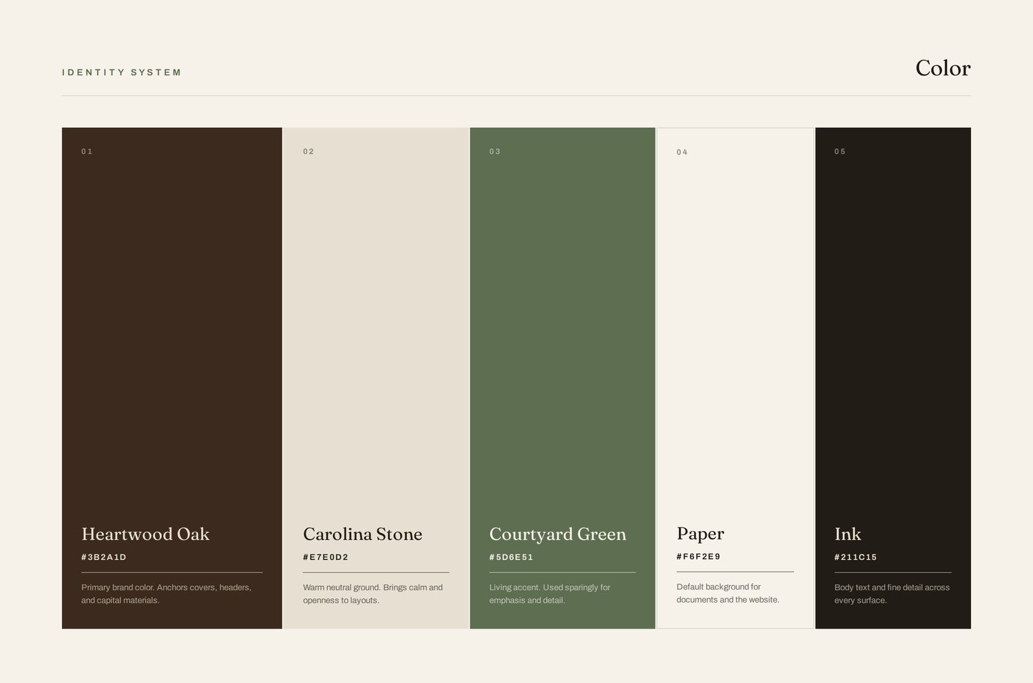
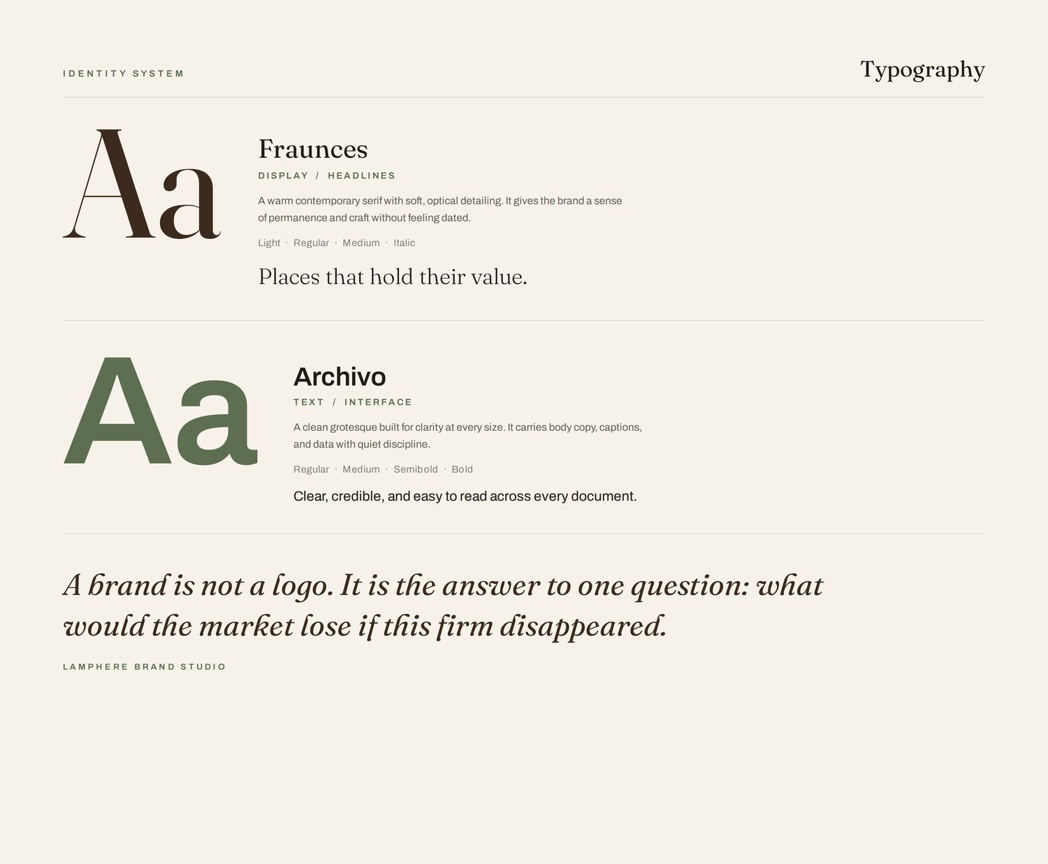
The palette draws on deep oak, weathered stone, and a grounded courtyard green, materials rather than corporate color. The typography pairs a confident serif with a clean, modern sans, established without being old-fashioned. Together they give the firm a brand that feels permanent on first sight.
A brand that signals a track record before the first meeting
Camden Oak now leads with an identity that matches the quality of its portfolio. The brand reads as grounded and credible to the partners and municipalities the firm depends on, and it gives every future project a consistent, recognizable signature.
It is a brand built, like the company, to last.