Juniper House
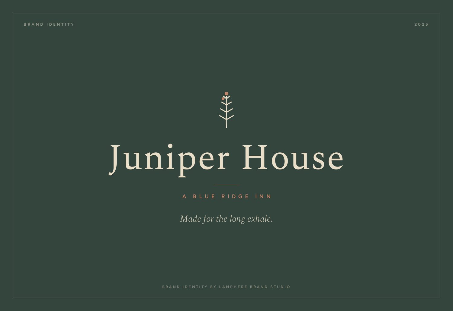
A Blue Ridge inn brand built around one feeling, the long exhale a guest takes on arrival.
An inn that needed to sell a feeling, not a room
Juniper House is a boutique inn in the Blue Ridge mountains of North Carolina. The property was lovely, but the brand described amenities when it should have been describing an experience.
We were asked to build an identity that captured why a guest comes to the mountains in the first place.
Hospitality branding sells the wrong thing
Most small hospitality brands sell features: the rooms, the rates, the list of things to do nearby. But guests do not travel for a feature list. They travel for a feeling, and a brand that only describes the room never reaches it.
Juniper House needed an identity built on the experience of being there, calm, restorative, unhurried.
Built around the long exhale
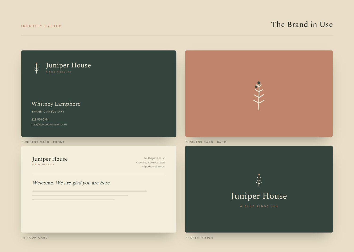
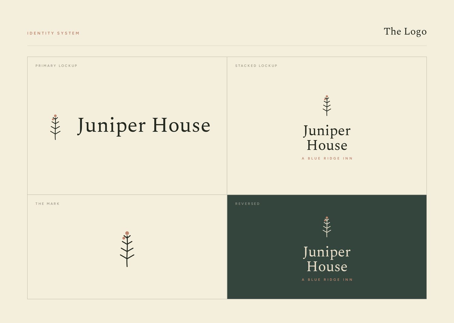
We named the feeling and built everything from it: the long exhale, the moment a guest's shoulders drop on arrival. The mark is a hand-drawn juniper sprig, botanical and quiet, a small piece of the place itself.
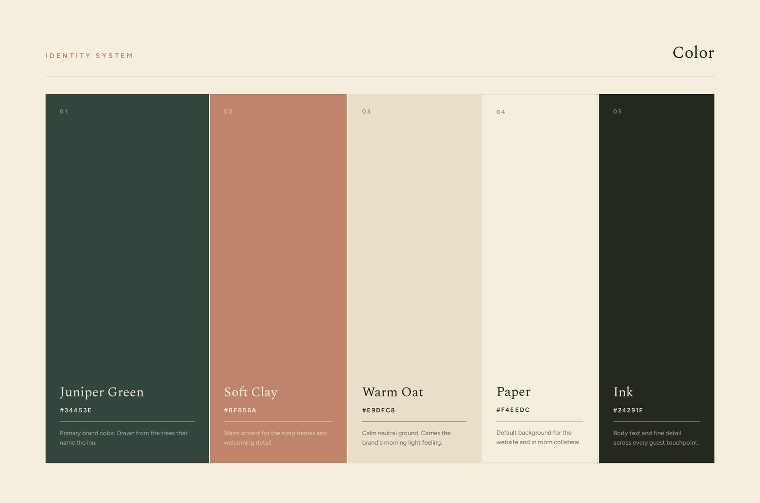
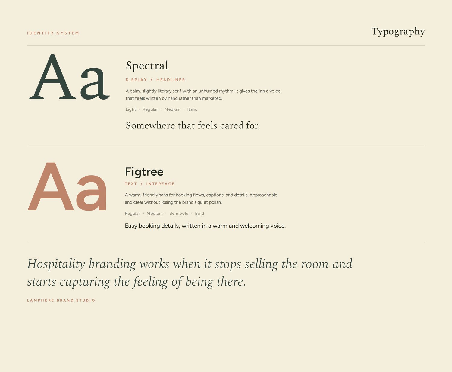
The palette of deep juniper green, soft clay, and warm oat feels like morning light in the mountains. A calm, slightly literary serif gives the brand a voice that sounds written by hand rather than marketed.
A brand a guest feels before they arrive
Juniper House now has an identity that does what hospitality branding should: it sets the feeling in advance. From the website to the in-room details, the brand is calm, considered, and unmistakably of its place.
It does not sell the room. It sells the exhale.