Harlow & Finch
A boutique law firm brand that signals discretion and quality before it says a single word.
A boutique firm caught between two cliches
Harlow & Finch is a boutique law firm in Charlotte handling private client and business matters. The firm's value was its discretion and the personal quality of its counsel, neither of which its brand communicated.
We were asked to build an identity that felt considered, established, and quietly confident.
Law firm branding pulls toward two extremes
Legal brands tend to land in one of two places: stuffy and dated, all columns and gold seals, or aggressively modern in a way that reads as a startup rather than a firm you trust with something serious.
Harlow & Finch needed a third option. An identity that felt current and crafted, but carried the gravity the work demands.
The ampersand as the mark
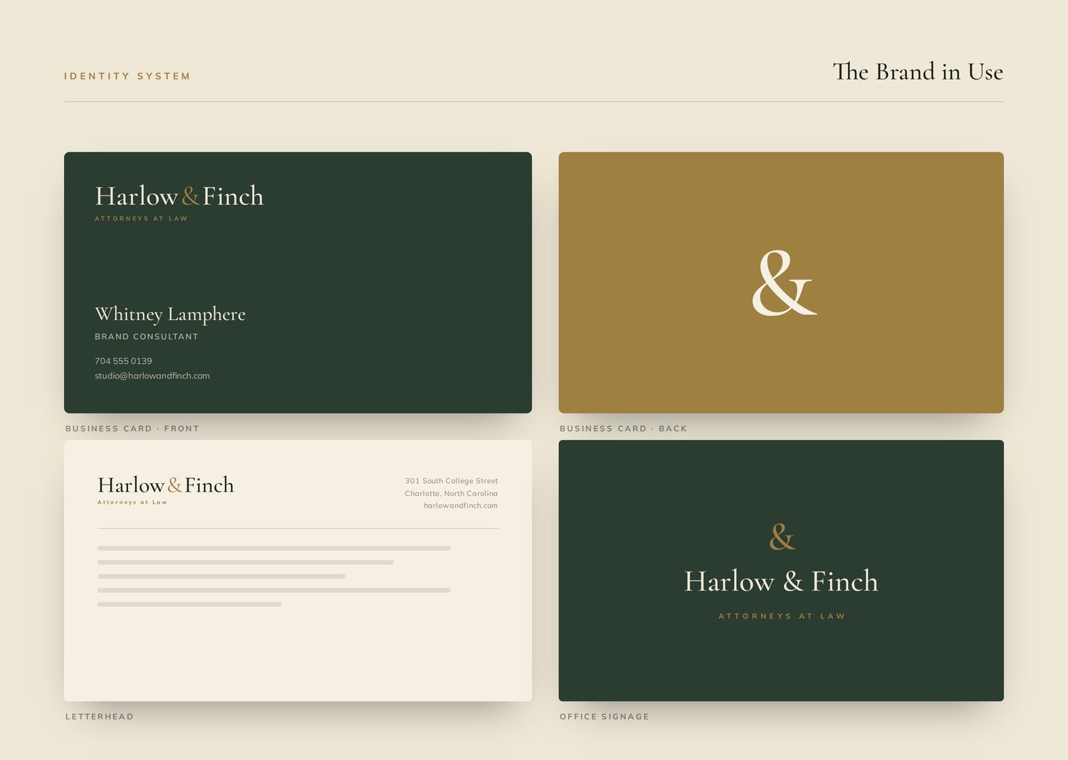
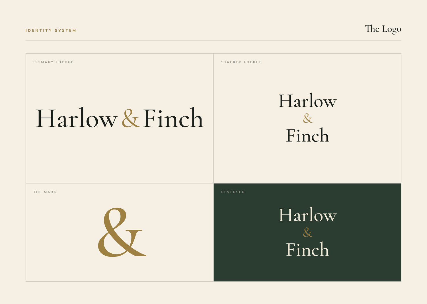
We made the ampersand the centerpiece of the identity. It is the quietest possible symbol of partnership, and drawn with care it signals craft and attention without a word of explanation.
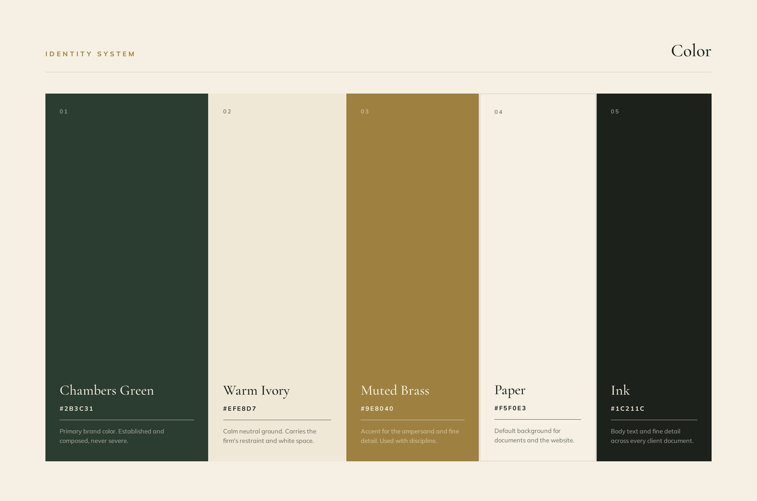
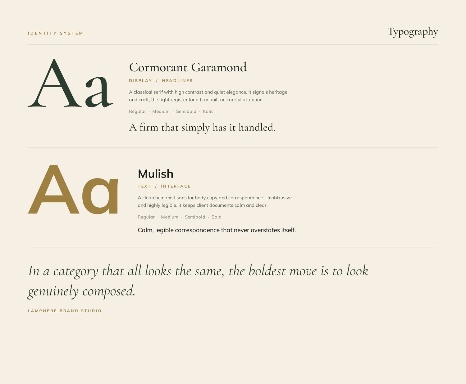
The palette of deep forest green, warm ivory, and brass feels established and refined rather than corporate. An elegant high-contrast serif, paired with a clean sans for clarity, gives the firm a voice that is composed and exact.
A brand that opens the conversation correctly
Harlow & Finch now presents an identity that matches the experience of working with the firm: discreet, careful, and quietly confident. The brand sets the right expectation before a prospective client has read a single line.
It signals discretion, and then the firm delivers it.